
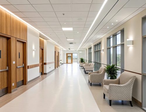
Design decisions in healthcare environments extend far beyond aesthetics. Color, lighting, materials, and layout all influence how patients feel upon entering a medical space. Among these elements, flooring plays a particularly important role because it occupies a large visual area and is constantly within a patient’s field of view. Quartz tiles, known for their durability, hygiene, and low maintenance, are increasingly popular in healthcare flooring. When combined with thoughtful color selection, they can significantly enhance patient comfort and overall experience.
Quartz tiles have several benefits for healthcare flooring, including their visual versatility. Here’s how choosing the right colors will improve patient experience.
Color and Psychological Responses
Color theory suggests that different hues can evoke specific emotional and psychological responses. In healthcare facilities, where patients often experience stress, anxiety, or discomfort, choosing calming, supportive colors is especially important. Flooring colors contribute to the visual atmosphere of a space and can promote best outcomes for patients, staff and guests.
Cool and Calm Colors
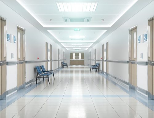
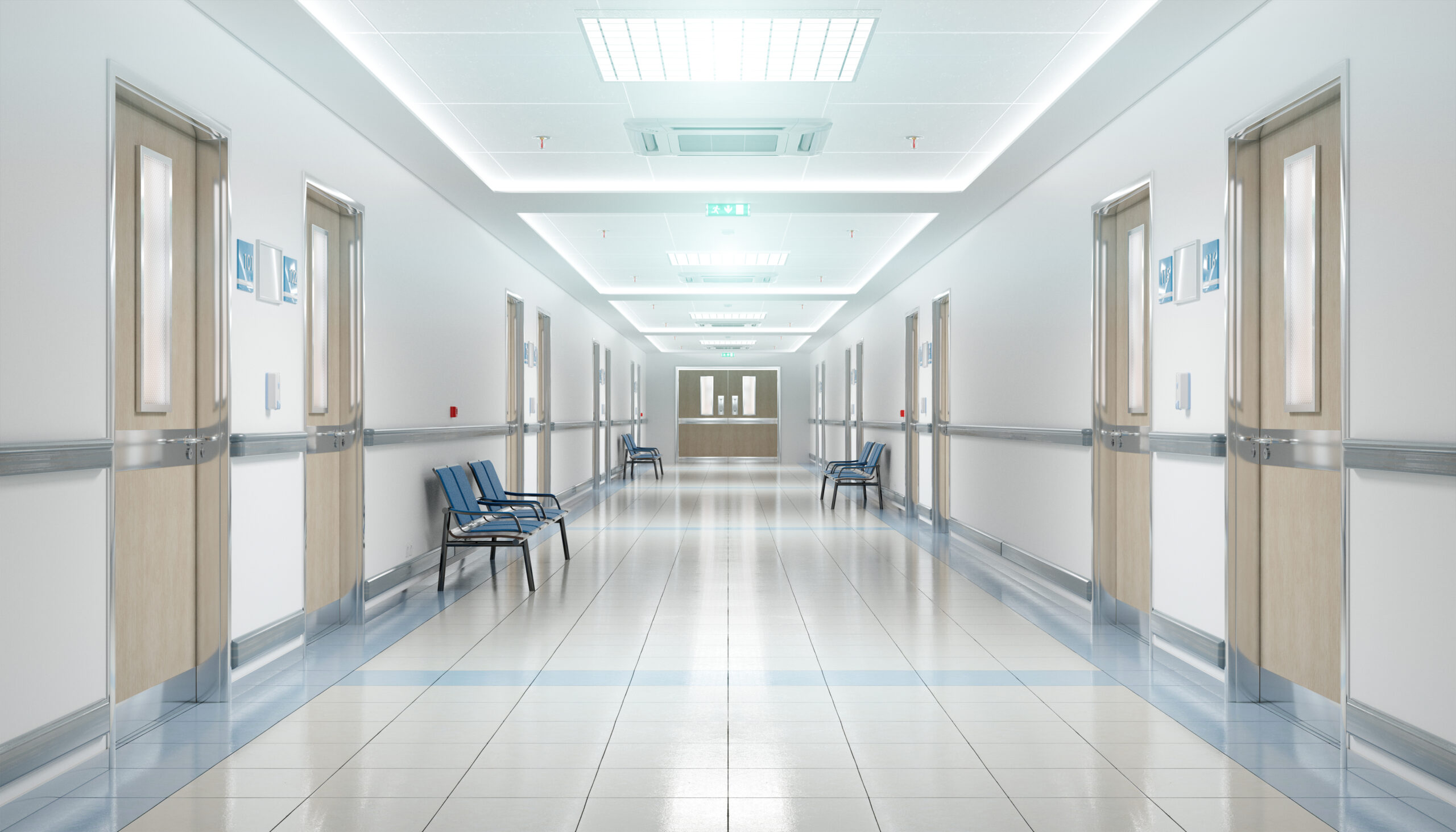
Soft blues and warm greens are among the most effective colors for healthcare flooring. Blue tones are commonly associated with calmness, stability, and trust, qualities that help patients feel safe and reassured during medical visits. Light blue quartz tiles can work particularly well in waiting areas, recovery rooms, and patient corridors where a soothing environment is essential. Similarly, green hues are strongly linked to nature and healing. Soft sage or muted green quartz tiles can create a restorative atmosphere that encourages relaxation and emotional balance.
Warm Neutrals
Neutral tones are another excellent option for healthcare facilities. Shades such as warm gray, beige, or soft taupe provide a clean and professional appearance while maintaining a welcoming feel. Neutral quartz flooring works well in high-traffic areas like hallways, lobbies, and nurses’ stations because it pairs easily with other design elements while helping conceal minor wear or dirt.
Pediatric Care
In pediatric environments, slightly brighter yet still balanced colors can be beneficial. Gentle pastels—such as pale yellow, mint green, or light lavender—can create a more cheerful, friendly atmosphere that reduces anxiety in young patients. Quartz tiles in these tones can add personality to children’s clinics without overwhelming the space.
Dark and Saturated Colors
It is also important to avoid overly saturated or extremely dark flooring colors. Intense reds or harsh contrasts can increase stress levels or cause visual fatigue. Dark floors, while sometimes elegant, may make spaces feel smaller or less inviting if not balanced properly with lighting and wall colors.
Rikett Quartz Tile for Healthcare Flooring
Selecting quartz tile colors for healthcare flooring should support both functionality and emotional well-being. By applying principles of color theory, healthcare designers can create environments that feel calm, safe, and welcoming, helping patients feel more comfortable throughout their care experience.
When you choose Rikett Quartz Tile for your healthcare flooring, you get much more than durability. You also get aesthetic versatility to provide the best experience and environment for your patients.


